
Layering Textures: How to Make Neutrals Feel Rich and Finished
7th Jul 2026
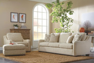
Neutral rooms can be beautiful, calm, and timeless, but they can also fall flat if everything has the same finish. A room with beige walls, a beige sofa, a beige rug, and beige pillows may technically coordinate, but it can still feel unfinished if there is no texture, contrast, or material variation.
That is where texture matters.
Texture is what makes a neutral room feel rich instead of plain. It adds depth without requiring bold color. It makes a space feel warmer, more comfortable, and more designed. The right mix of fabric, leather, wood, metal, rugs, window treatments, and accessories can turn a simple neutral palette into a room that feels layered and complete.
The goal is not to add more stuff. The goal is to add the right surfaces.
What does texture mean in interior design?
Texture is the way a surface looks or feels.
It can be physical, like:
-
Nubby fabric
-
Smooth leather
-
Rough wood grain
-
Woven shades
-
Quilted bedding
-
Soft velvet
-
Wool rugs
-
Linen drapery
-
Ceramic lamps
-
Hammered metal
It can also be visual, like:
-
A subtle pattern
-
A tonal weave
-
Wood grain
-
Stone variation
-
A matte finish
-
A high-low rug
-
A ribbed cabinet front
-
A basketweave detail
Texture gives the eye something to notice, even when the color palette stays quiet.
Why neutrals need texture
Color can create interest, but in neutral rooms, texture does most of the work.
Without texture, a neutral room can feel:
-
Flat
-
Plain
-
Unfinished
-
Too matched
-
Cold
-
Washed out
-
Like a showroom
-
Like something is missing
With texture, that same neutral room can feel:
-
Warm
-
Layered
-
Polished
-
Comfortable
-
Timeless
-
Inviting
-
Custom
-
More expensive
A rich neutral room is rarely built from one beige or one gray. It is usually built from several related tones and several different materials.
Start with a simple neutral palette
Before layering texture, keep the color palette controlled.
A strong neutral palette might include:
-
Cream
-
Oatmeal
-
Taupe
-
Warm gray
-
Greige
-
Mushroom
-
Ivory
-
Camel
-
Soft brown
-
Charcoal
-
Natural linen
-
Warm white
You do not need all of these in one room. Choose a small group that works together.
A good starting formula:
-
One main neutral
-
One supporting neutral
-
One deeper grounding tone
-
One natural material tone, such as wood or leather
Example:
-
Cream sofa
-
Oatmeal rug
-
Warm walnut tables
-
Charcoal lamp bases
Or:
-
Greige sectional
-
Ivory pillows
-
Natural oak tables
-
Soft black metal accents
The palette should feel calm before the texture is added.
Layer light, medium, and dark neutrals
A neutral room needs value contrast. Value means how light or dark something is.
If everything is the same light tone, the room may feel washed out. If everything is the same dark tone, it may feel heavy. A mix of light, medium, and dark neutrals gives the room shape.
Try this:
-
Light: walls, sofa, bedding, or drapery
-
Medium: rug, accent chairs, ottoman, or pillows
-
Dark: lamps, picture frames, wood furniture, leather, or metal
Example:
-
Ivory walls
-
Oatmeal sofa
-
Taupe rug
-
Walnut coffee table
-
Black lamp base
This keeps the room neutral but gives it depth.
Mix at least three texture types
A good neutral room usually needs more than one texture.
A simple texture formula:
-
Soft texture
-
Natural texture
-
Smooth or structured texture
For example:
-
Soft texture: chenille sofa, wool rug, velvet pillow
-
Natural texture: wood table, woven shade, jute basket
-
Smooth texture: leather chair, ceramic lamp, metal hardware
This mix keeps the room from feeling one-note.
If everything is soft, the room can feel overly casual. If everything is hard, the room can feel cold. If everything is smooth, the room can feel flat. Balance is the key.
Use upholstery as the largest texture
Your sofa, sectional, chairs, and ottoman are some of the largest texture decisions in the room.
A neutral sofa can feel very different depending on the upholstery.
Smooth fabric
Smooth fabric feels cleaner and more tailored.
Best for:
-
Modern rooms
-
Transitional rooms
-
Formal spaces
-
A cleaner, quieter look
Textured fabric
Textured fabric feels warmer and more forgiving.
Best for:
-
Family rooms
-
Neutral rooms
-
High-use spaces
-
Casual or layered rooms
Chenille
Chenille can add softness and depth without needing pattern.
Best for:
-
Comfortable family rooms
-
Sofas and sectionals
-
Cozy neutral spaces
Linen-look fabric
Linen-look fabric feels relaxed, natural, and timeless.
Best for:
-
Casual living rooms
-
Slipcovered-style pieces
-
Soft neutral palettes
-
Bedrooms
Boucle-style texture
Boucle adds a nubby, dimensional surface.
Best for:
-
Accent chairs
-
Ottomans
-
Modern or transitional rooms
-
Spaces that need softness and shape
Leather
Leather adds smoothness, warmth, weight, and character.
Best for:
-
Accent chairs
-
Recliners
-
Ottomans
-
Sofas that need richness
-
Rooms that need contrast
A neutral room often looks best when upholstery textures are mixed. A fabric sofa with leather chairs, or a leather sofa with textured fabric chairs, usually feels more layered than everything in the same material.
Add wood for warmth
Wood is one of the easiest ways to make neutrals feel richer.
Wood adds:
-
Grain
-
Warmth
-
Depth
-
Natural variation
-
Structure
-
Contrast
Good places to use wood:
-
Coffee table
-
End tables
-
Console table
-
Media console
-
Dining table
-
Bed frame
-
Nightstands
-
Picture frames
-
Chair legs
-
Shelving
-
Built-ins
The wood does not have to match perfectly. In fact, a room often feels more natural when wood tones relate instead of matching exactly.
Good wood pairings:
-
Light oak with cream and linen
-
Walnut with ivory and warm gray
-
Cherry with taupe and leather
-
Maple with soft white and blue-gray
-
Dark wood with oatmeal and brass
-
Amish-made solid wood with textured upholstery and wool rugs
The key is repetition. If one wood tone appears only once, it can feel random. Repeat a similar warmth elsewhere in the room.
Use leather as a grounding texture
Leather is especially useful in neutral rooms because it adds contrast without adding a busy pattern.
A leather piece can make a room feel:
-
More grounded
-
More collected
-
More classic
-
Warmer
-
More tailored
-
More substantial
Good leather additions:
-
Leather recliner
-
Leather accent chair
-
Leather ottoman
-
Leather sofa
-
Leather-wrapped tray
-
Leather pillows
-
Leather dining chairs
-
Leather bench
Warm leather tones like cognac, saddle, chestnut, chocolate, and caramel work beautifully with cream, oatmeal, taupe, olive, black, and natural wood.
If the room feels too soft or pale, leather can give it weight.
Use rugs to anchor texture
A rug is one of the most important texture layers in a room.
A rug can add:
-
Softness
-
Pattern
-
Color variation
-
Warmth
-
Contrast
-
Definition
-
Comfort underfoot
In a neutral room, the rug often does one of two jobs.
Quiet texture
A quiet rug keeps the room calm.
Good choices:
-
Wool rug
-
Jute rug
-
Sisal rug
-
Tonal pattern
-
Soft geometric
-
High-low texture
-
Subtle stripe
-
Neutral vintage-inspired rug
Visual movement
A rug with more pattern can bring life to a neutral room.
Good choices:
-
Muted traditional pattern
-
Tone-on-tone design
-
Soft check
-
Neutral medallion
-
Pattern with cream, taupe, gray, camel, and charcoal
If the sofa is plain, the rug can carry more texture or pattern. If the sofa fabric is already highly textured or patterned, keep the rug quieter.
Layer pillows with different surfaces
Throw pillows are one of the easiest ways to layer texture.
Instead of using five pillows in the same flat fabric, mix materials.
Good pillow textures:
-
Linen
-
Velvet
-
Chenille
-
Boucle
-
Woven cotton
-
Wool
-
Leather
-
Embroidered fabric
-
Nubby weave
-
Small stripe
-
Tone-on-tone pattern
A simple pillow formula:
-
One solid textured pillow
-
One subtle pattern
-
One smaller lumbar or accent pillow
For a sofa:
-
Use larger pillows in the back
-
Use smaller pillows or lumbar pillows in front
-
Mix smooth and textured fabrics
-
Keep the colors related
Example:
-
22 inch oatmeal woven pillow
-
20 inch taupe velvet pillow
-
Long lumbar with a small stripe
This adds interest without making the sofa feel messy.
Add throws with purpose
A throw blanket should add texture, not clutter.
Good throw options:
-
Waffle weave
-
Knit
-
Wool blend
-
Linen
-
Cotton
-
Herringbone
-
Faux fur in moderation
-
Soft fringe
-
Textured neutral
Use throws on:
-
Sofa arm
-
Chair back
-
Ottoman
-
Bed foot
-
Bench
-
Basket near seating
If the room is already heavily textured, choose a simpler throw. If the room feels flat, choose something with more weave or weight.
A throw should look relaxed, but intentional.
Use window treatments as a texture layer
Window treatments are often overlooked, but they can change the entire room.
Good texture options:
-
Woven wood shades
-
Roman shades
-
Linen-look drapery
-
Soft cotton panels
-
Textured performance fabric
-
Layered shades and drapery
Window treatments add vertical softness. They also help connect walls, flooring, upholstery, and rugs.
For a timeless neutral room, choose window treatments that relate to the other materials:
-
Linen drapery with upholstered furniture
-
Woven shades with wood tables
-
Soft taupe panels with a neutral rug
-
Warm white drapery with cream bedding
Window treatments should not feel like an afterthought. They are one of the largest soft surfaces in the room.
Mix matte, satin, and subtle shine
Texture is not only about fabric. Finish matters too.
A room with all matte surfaces may feel dull. A room with too much shine may feel cold or flashy. The best neutral rooms usually mix finishes.
Good finish combinations:
-
Matte walls
-
Satin wood finish
-
Soft fabric upholstery
-
Brushed metal lamps
-
Ceramic accessories
-
Glass or stone accents in small amounts
Use subtle shine through:
-
Brass lamps
-
Bronze hardware
-
Glass table lamp
-
Ceramic vase
-
Metal picture frame
-
Small tray
-
Mirror
-
Polished stone top
The shine should be controlled. It should catch light, not dominate the room.
Use metal as a small but important layer
Metal adds structure to soft neutral rooms.
Good metal finishes include:
-
Brass
-
Bronze
-
Aged brass
-
Matte black
-
Pewter
-
Brushed nickel
-
Iron
Use metal in:
-
Lamps
-
Drawer pulls
-
Table bases
-
Picture frames
-
Mirrors
-
Curtain rods
-
Light fixtures
-
Trays
-
Decorative objects
Warm metals like brass and bronze add softness. Black metal adds definition. Pewter and brushed nickel feel cooler and cleaner.
Repeat the metal finish in at least two or three places so it feels intentional.
Add ceramic, stone, and glass for contrast
Hard materials help balance soft upholstery and textiles.
Good options:
-
Ceramic lamps
-
Stone coffee table
-
Marble tray
-
Travertine accent
-
Glass vase
-
Clay pottery
-
Stoneware bowl
-
Concrete-look planter
These pieces do not have to be large. A ceramic lamp, stone tray, or textured vase can add just enough contrast to make the room feel finished.
The best neutral rooms often have a mix of soft and hard materials.
Layer texture in the right order
A room feels more intentional when texture is built from large to small.
Start with:
-
Flooring
-
Rug
-
Large upholstery
-
Wood furniture
-
Window treatments
-
Pillows and throws
-
Lamps and lighting
-
Art and accessories
This order helps the room feel planned instead of decorated piece by piece.
If the biggest surfaces are flat and plain, the room may require more accessories to feel complete. If the largest surfaces already have texture, the smaller layers can stay simpler.
Make neutrals richer with tone-on-tone contrast
Tone-on-tone means using several shades from the same color family.
For example:
-
Cream
-
Oatmeal
-
Sand
-
Taupe
-
Warm brown
Or:
-
Soft white
-
Greige
-
Stone
-
Charcoal
-
Black
Tone-on-tone rooms feel calm because the colors are related. They feel rich because the values and textures change.
A tone-on-tone neutral room might include:
-
Cream walls
-
Oatmeal sofa
-
Taupe rug
-
Walnut tables
-
Ivory pillows
-
Brass lamps
-
Charcoal picture frames
No single item screams for attention, but the room still feels complete.
Repeat textures in small ways
A texture should not appear once and disappear.
If you use woven texture, repeat it:
-
Woven shades
-
Basket
-
Woven pillow
-
Natural fiber rug
If you use leather, repeat it:
-
Leather chair
-
Leather tray
-
Warm brown pillow detail
-
Cognac tone in artwork
If you use black metal, repeat it:
-
Lamp base
-
Curtain rod
-
Picture frame
-
Table leg
Repetition helps a room feel connected.
Avoid too many competing textures
Texture is important, but too much can become busy.
A room can feel cluttered if it has:
-
Too many chunky weaves
-
Too many bold patterns
-
Too many wood tones
-
Too many metal finishes
-
Too many small accessories
-
Too many high-contrast surfaces
-
Too many different styles
A good rule: vary the texture, but keep the color palette controlled.
If the colors are quiet, you can layer more texture. If the patterns are strong, use fewer texture types.
Texture ideas by room
Living room
Good layers:
-
Textured sofa fabric
-
Leather chair
-
Wool or natural fiber rug
-
Wood coffee table
-
Linen drapery
-
Ceramic lamps
-
Mixed pillows
-
Woven baskets
A living room should feel comfortable from both a distance and up close. Texture makes the seating area feel finished.
Bedroom
Good layers:
-
Upholstered or wood headboard
-
Cotton sheets
-
Quilt or coverlet
-
Duvet
-
Woven throw
-
Wool rug
-
Linen drapery
-
Ceramic lamps
-
Wood nightstands
A bedroom should feel softer and calmer than the rest of the home. Use fewer hard surfaces and more soft texture.
Dining room
Good layers:
-
Solid wood dining table
-
Upholstered chairs
-
Textured rug if practical
-
Woven shades
-
Ceramic centerpiece
-
Metal light fixture
-
Sideboard with wood grain
-
Linen napkins or table runner
Dining rooms benefit from a balance of hard surfaces and softening details.
Open concept spaces
Good layers:
-
Coordinated rugs
-
Repeated wood tones
-
Fabric sofa
-
Leather chairs or stools
-
Dining chair upholstery
-
Window treatments
-
Matching metal accents
-
Similar neutral palette across areas
Open spaces need texture repetition so living, dining, and kitchen areas feel connected.
Texture ideas by style
Traditional
Use:
-
Velvet
-
Leather
-
Wool rugs
-
Wood grain
-
Nailhead trim
-
Patterned pillows
-
Brass or bronze
-
Framed art
-
Classic lamps
Transitional
Use:
-
Textured neutral upholstery
-
Clean wood tables
-
Leather accents
-
Soft rugs
-
Linen-look drapery
-
Ceramic lamps
-
Subtle metal finishes
Modern
Use:
-
Smooth fabric
-
Boucle
-
Low-pile rugs
-
Matte metal
-
Stone
-
Glass
-
Clean wood grain
-
Larger sculptural pieces
Farmhouse or relaxed
Use:
-
Linen-look fabric
-
Woven shades
-
Natural fiber rugs
-
Warm wood
-
Cotton throws
-
Baskets
-
Soft neutral pillows
-
Aged metal
Mid-century
Use:
-
Walnut
-
Leather
-
Textured fabric
-
Low-profile rugs
-
Tapered legs
-
Ceramic lamps
-
Simple woven pillows
Texture should support the style direction without turning the room into a theme.
How to keep a neutral room from feeling boring
If a neutral room feels boring, it usually needs one or more of these:
More texture
Add:
-
Woven pillow
-
Wool rug
-
Wood table
-
Leather chair
-
Linen drapery
-
Ceramic lamp
More contrast
Add:
-
Deeper wood tone
-
Charcoal accent
-
Black frame
-
Darker rug detail
-
Leather piece
More shape variation
Add:
-
Round coffee table
-
Curved chair
-
Sculptural lamp
-
Oval mirror
-
Tapered leg furniture
More natural material
Add:
-
Solid wood
-
Woven shade
-
Stoneware
-
Jute
-
Sisal
-
Leather
-
Wool
More lighting
Add:
-
Table lamps
-
Floor lamp
-
Sconces
-
Picture light
-
Dimmer
Texture and light work together. A textured room looks better when light can move across the surfaces.
Common texture layering mistakes
Mistake 1: Everything is the same fabric
A sofa, chair, pillows, and ottoman in nearly identical fabric can feel flat.
Mistake 2: The rug is too plain for the room
If the upholstery and walls are simple, the rug may need texture or subtle pattern.
Mistake 3: Too many small accessories
Texture should come from meaningful materials, not clutter.
Mistake 4: No contrast
A neutral room still needs light, medium, and dark tones.
Mistake 5: Too many wood tones with no connection
Wood tones do not have to match, but they should relate or repeat.
Mistake 6: Ignoring window treatments
Bare windows can make a neutral room feel unfinished.
Mistake 7: Relying only on pillows
Pillows help, but rich texture should also come from rugs, upholstery, wood, lighting, and window treatments.
Simple texture formulas that work
Warm neutral living room
-
Oatmeal sofa
-
Cognac leather chair
-
Wool rug
-
Walnut coffee table
-
Linen drapery
-
Ceramic lamps
-
Black metal accents
Light and calm bedroom
-
Upholstered headboard
-
Cotton sheets
-
Quilted coverlet
-
Linen duvet
-
Woven bench
-
Wool rug
-
Warm wood nightstands
Refined family room
-
Performance fabric sectional
-
Leather ottoman
-
Textured rug
-
Wood media console
-
Woven baskets
-
Soft throw pillows
-
Bronze lamps
Small neutral room
-
Slim-arm sofa in textured fabric
-
Round wood table
-
Light rug with subtle pattern
-
One leather or woven accent
-
Wall-mounted lighting
-
Simple linen-look drapery
Open concept space
-
Fabric sofa
-
Wood dining table
-
Upholstered dining chairs
-
Coordinated rugs
-
Woven window treatments
-
Repeated black or bronze accents
-
Similar neutral tones throughout
Texture checklist before the room is finished
Before calling a neutral room done, ask:
-
Does the room have light, medium, and dark tones?
-
Are there at least three texture types?
-
Is there a mix of soft, hard, smooth, and natural materials?
-
Does the rug add enough texture or pattern?
-
Do the window treatments soften the room?
-
Is there wood or leather to add warmth?
-
Are metal finishes repeated?
-
Do pillows and throws add texture without clutter?
-
Does every texture connect to something else in the room?
-
Does the room feel calm, but not flat?
A neutral room should feel simple at first glance and interesting when you look closer.
Final thoughts
Layering texture is what makes neutrals feel rich and finished. A room does not need bright color or heavy pattern to feel complete. It needs contrast, depth, and material variety.
Start with a calm palette. Add soft upholstery, warm wood, a well-sized rug, leather or metal accents, window treatments, pillows, throws, lighting, and a few natural materials. Keep the colors connected, but let the surfaces vary.
When texture is layered well, a neutral room feels timeless, comfortable, and intentionally designed.