
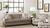
Creating a Cohesive Color Palette: A Simple 60-30-10 Approach for Furniture
17th Nov 2026
Choosing individual furniture pieces is often easier than making all of them work together.
You may like the sofa fabric, the rug, the leather chair, the wood finish, and the accent pillows separately, but once they are in the same room, the colors can start competing. Other rooms have the opposite problem: everything is so similar that the space feels flat.
The 60-30-10 approach is a simple way to bring those decisions together.
The basic idea is:
-
60% dominant color
-
30% secondary color
-
10% accent color
These percentages are not measurements you need to calculate. They are a way to think about visual weight.
The largest surfaces create the background. A second color gives the room depth. A smaller accent adds contrast and personality.
For furniture shopping, this approach can make choosing upholstery, wood finishes, rugs, chairs, pillows, and accessories much easier.
What does 60-30-10 actually mean?
Think of the room in three layers.
60%: the dominant color
This is the color you notice across the largest areas.
It may appear in:
-
Walls
-
Large sofa or sectional
-
Flooring
-
Large rug
-
Bedding
-
Large window treatments
-
Major cabinetry
The dominant color usually creates the overall mood of the room.
In many homes, this is a neutral such as:
-
Cream
-
Warm white
-
Beige
-
Greige
-
Taupe
-
Warm gray
-
Soft brown
It does not have to be neutral, but a quieter dominant color generally gives you more flexibility with furniture.
30%: the secondary color
The secondary color should be different enough to add depth but related enough to feel comfortable with the dominant color.
It may appear in:
-
Accent chairs
-
Rug
-
Drapery
-
Wood furniture
-
Leather seating
-
Bedding
-
Dining chairs
-
Large case pieces
-
Upholstered headboard
This is often where the room begins to feel layered.
10%: the accent color
The accent is the smallest layer.
It may appear in:
-
Pillows
-
Artwork
-
Lamps
-
Throws
-
Decorative objects
-
Small ottoman
-
Floral arrangements
-
Table accessories
-
Hardware
-
Small doses within a rug
This is where you can use stronger color or contrast without committing the entire room to it.
Do not treat the percentages as exact math
A room does not need to be exactly 60% cream, 30% brown, and 10% green.
That is not the point.
Think of the rule as:
-
A lot of one color
-
A meaningful amount of another
-
A small dose of contrast
If the room ends up closer to 65-25-10 or 60-35-5, that is fine.
The purpose is simply to prevent every color from having equal visual weight.
When every color is equally strong, the room can feel busy.
When everything is the same color, it can feel flat.
The 60-30-10 approach gives the room a hierarchy.
Start with the things you are not changing
Before choosing a furniture palette, identify the fixed elements.
These may include:
-
Flooring
-
Wall color
-
Fireplace stone
-
Kitchen cabinets
-
Built-ins
-
Countertops
-
Trim
-
Existing rug
-
Window treatments
These elements may already account for much of the 60%.
For example:
If you have warm oak floors and cream walls, your dominant palette may already be warm neutral.
You do not need to make the sofa the exact same color. Instead, the sofa can sit within that family while the secondary and accent colors create contrast.
The 60% color does not have to be one exact shade
This is especially important in neutral rooms.
Your dominant 60% might include several related shades:
-
Warm white walls
-
Oatmeal sofa
-
Cream drapery
-
Light beige rug
Those are not identical colors, but they belong to the same visual family.
This creates a more layered room than repeating one exact beige everywhere.
Think in color families, not paint chips.
Use undertones to keep the palette connected
A cohesive palette depends on undertones.
Warm neutrals may include:
-
Cream
-
Camel
-
Oatmeal
-
Warm taupe
-
Mushroom
-
Cognac
-
Olive
-
Warm brown
Cooler neutrals may include:
-
Soft gray
-
Stone
-
Slate
-
Blue-gray
-
Pewter
-
Charcoal
-
Cool taupe
A room can mix warm and cool elements, but there should be a bridge between them.
For example:
-
Warm oak floors
-
Greige sofa
-
Taupe rug
-
Charcoal accents
The greige and taupe help connect the warm floor to the cooler charcoal.
Use the sofa as part of the dominant color
Because a sofa or sectional occupies so much visual space, it often belongs in the 60% category.
This is one reason neutral sofas are so flexible.
Good dominant sofa colors include:
-
Cream
-
Oatmeal
-
Taupe
-
Greige
-
Warm gray
-
Mushroom
-
Soft brown
-
Natural linen
A neutral sofa gives you room to change the 30% and 10% layers over time.
For example:
60%
-
Cream walls
-
Oatmeal sofa
30%
-
Walnut furniture
-
Taupe rug
10%
-
Olive pillows
-
Brass lamps
The room has color without making the sofa the most difficult piece to coordinate later.
The sofa can also be the 30%
The sofa does not always have to disappear into the dominant palette.
If the walls and flooring already create a strong neutral background, the sofa can become the secondary color.
For example:
60%
-
Warm white walls
-
Light oak floors
-
Cream rug
30%
-
Olive sofa
-
Olive repeated in drapery or artwork
10%
-
Black and brass details
This works especially well when you want upholstery with more personality.
Accent chairs are perfect for the 30%
Accent chairs are one of the easiest places to introduce the secondary color.
They are large enough to matter but smaller than the sofa.
Good secondary chair colors might include:
-
Olive
-
Navy
-
Camel
-
Cognac leather
-
Rust
-
Charcoal
-
Soft blue
-
Patterned neutral
-
Plaid
-
Muted green
For example:
60%
-
Cream sofa
-
Warm white walls
30%
-
Pair of cognac leather chairs
-
Brown tones in rug
10%
-
Black lamps and dark artwork
The leather chairs give the room structure without taking over.
Leather can act as a color
Leather is not just a material. It should be counted as part of the palette.
Common leather colors include:
-
Cognac
-
Saddle
-
Caramel
-
Chestnut
-
Chocolate
-
Black
-
Gray
-
Cream
A cognac leather chair may become the secondary 30%.
A small leather ottoman may function more like the 10%.
Think about how much visual space the leather occupies.
Wood tones count too
Wood furniture is another major part of the color palette.
Do not ignore:
-
Coffee tables
-
End tables
-
Dining tables
-
Media consoles
-
Bedroom furniture
-
Sideboards
-
Chair legs
-
Cabinets
A walnut dining table may function as the 30% secondary tone.
A dark wood coffee table may become part of the room's grounding accent.
Wood gives you color without introducing a painted hue.
This is especially useful in neutral rooms.
A neutral room can still use 60-30-10
The rule does not require bright colors.
A completely neutral room might look like this:
60%
Cream and oatmeal
30%
Taupe and warm wood
10%
Charcoal and black
The differences come from value and texture rather than bright color.
Another example:
60%
Warm white
30%
Mushroom
10%
Cognac
Or:
60%
Greige
30%
Walnut brown
10%
Muted olive
This is one reason the 60-30-10 approach works well in timeless interiors.
Texture keeps a neutral palette from feeling flat
If your colors are close together, change the textures.
For example:
60%
-
Cream walls
-
Oatmeal chenille sofa
30%
-
Walnut table
-
Wool taupe rug
10%
-
Leather pillow
-
Brass lamp
-
Black picture frame
Even though the palette is restrained, the materials are different.
Use texture through:
-
Chenille
-
Leather
-
Wood
-
Wool
-
Linen
-
Velvet
-
Woven shades
-
Stone
-
Ceramic
-
Metal
Color and texture should work together.
Rugs can carry more than one part of the palette
A rug is useful because it can connect all three colors.
For example, a patterned rug might include:
-
Cream background
-
Taupe pattern
-
Small amount of olive
That rug visually connects:
-
60% cream
-
30% taupe
-
10% olive
This is one of the easiest ways to make a color palette feel cohesive.
Instead of choosing a rug after everything else, use it as a bridge.
Start with the rug if it has strong pattern
Sometimes the easiest order is:
-
Choose rug
-
Pull dominant neutral from rug
-
Pull secondary tone from rug
-
Pull accent color from rug
This works especially well with:
-
Traditional rugs
-
Oriental-inspired rugs
-
Patterned wool rugs
-
Vintage-style rugs
-
Multi-color carpets
A rug with several related colors can essentially give you the palette.
Walls are usually part of the 60%
Walls cover such a large visual area that they naturally become part of the dominant color.
This does not mean the walls need to match the sofa.
In fact, slight contrast is often better.
Examples:
-
Warm white wall + oatmeal sofa
-
Cream wall + taupe sofa
-
Greige wall + cream sofa
-
Soft gray wall + charcoal sofa
-
Beige wall + olive sofa
The wall and sofa should relate, not disappear into each other.
Flooring also affects the 60%
Because flooring covers the entire room, it may already influence the dominant color heavily.
Warm wood floors
Consider dominant colors like:
-
Cream
-
Oatmeal
-
Warm gray
-
Taupe
-
Mushroom
Gray floors
Consider:
-
Greige
-
Stone
-
Soft white
-
Charcoal
-
Cool taupe
Dark floors
Consider:
-
Cream
-
Light taupe
-
Oatmeal
-
Warm white
Light floors
You can often use:
-
Medium taupe
-
Charcoal
-
Olive
-
Cognac
-
Warm gray
The flooring should be part of the color plan from the beginning.
Use contrast carefully
A good palette usually has at least one darker element.
Without it, a neutral room can look washed out.
Dark accents might include:
-
Black lamp
-
Charcoal pillow
-
Dark walnut table
-
Black picture frame
-
Bronze hardware
-
Deep navy chair
-
Dark rug detail
You do not need much.
That small 10% layer can provide the contrast that makes the rest of the room look more intentional.
The 10% does not have to be bright
Accent color is often described as a "pop of color," but it does not need to be bright.
Your 10% could be:
-
Black
-
Charcoal
-
Cognac
-
Deep brown
-
Olive
-
Navy
-
Rust
-
Brass
-
Bronze
A restrained accent usually creates a more timeless room.
Use two accent colors if the room needs more depth
You can divide the 10% into smaller accents.
For example:
60%
-
Cream
30%
-
Warm walnut
10%
-
5% olive
-
5% black
Or:
60%
-
Greige
30%
-
Cognac
10%
-
5% navy
-
5% brass
This gives you more flexibility without losing the overall hierarchy.
Repeat the accent color
A color should rarely appear only once.
If you choose olive as the accent, repeat it in two or three places.
For example:
-
Pillow
-
Artwork
-
Small detail in rug
If you choose black:
-
Lamp base
-
Picture frame
-
Curtain rod
If you choose cognac:
-
Leather chair
-
Brown detail in rug
-
Decorative box
Repetition makes the accent feel intentional.
Do not scatter the accent everywhere
Repetition does not mean putting the same color on every surface.
If the 10% accent becomes:
-
Pillows
-
Curtains
-
Chairs
-
Rug
-
Artwork
-
Lamps
-
Accessories
-
Ottoman
It is no longer an accent.
Let the dominant and secondary colors do most of the work.
A simple living room formula
Try:
60%
-
Warm white walls
-
Oatmeal sofa
-
Cream drapery
30%
-
Walnut tables
-
Taupe rug
-
Brown leather chair
10%
-
Olive pillows
-
Black lamp bases
-
Green in artwork
Result:
Warm, layered, and neutral without feeling plain.
A warmer living room formula
60%
-
Cream walls
-
Beige sectional
30%
-
Cognac leather chairs
-
Warm wood furniture
10%
-
Deep green
-
Bronze accents
Result:
A room with warmth and contrast that still feels timeless.
A cooler living room formula
60%
-
Soft gray walls
-
Greige sofa
30%
-
Charcoal chairs
-
Cool walnut furniture
10%
-
Muted blue
-
Black metal
Result:
Clean and calm without becoming overly gray.
A traditional living room formula
60%
-
Warm beige or cream
30%
-
Rich wood
-
Brown leather
-
Traditional rug tones
10%
-
Deep green
-
Burgundy
-
Brass
You do not need to use every accent. Choose one or two.
The stronger wood and rug colors provide much of the visual depth.
A transitional living room formula
60%
-
Cream or greige
30%
-
Taupe
-
Walnut
-
Cognac
10%
-
Black
-
Olive
-
Brass
This approach works particularly well because transitional rooms naturally balance warm traditional materials with cleaner modern lines.
A dining room formula
The 60-30-10 rule works just as well in dining spaces.
60%
-
Walls
-
Flooring
-
Large rug
30%
-
Dining table
-
Chairs
-
Sideboard
10%
-
Artwork
-
Drapery detail
-
Centerpiece
-
Lighting finish
Example:
60%
-
Warm white walls
-
Cream rug
30%
-
Walnut dining table
-
Taupe upholstered chairs
10%
-
Black chandelier
-
Green artwork
The room feels coordinated without every piece matching.
A bedroom formula
Bedrooms usually benefit from a quieter version of the rule.
60%
-
Walls
-
Bedding
-
Carpet or large rug
30%
-
Bed or headboard
-
Wood furniture
-
Drapery
10%
-
Pillows
-
Lamps
-
Artwork
-
Throw
Example:
60%
-
Cream walls and bedding
30%
-
Warm walnut furniture
-
Mushroom upholstered headboard
10%
-
Muted blue pillows
-
Bronze lamps
The result feels restful rather than over-decorated.
An open concept formula
Open concept spaces can be more challenging because several rooms are visible at once.
Instead of giving every zone a completely different palette, repeat the same colors in different amounts.
For example:
Living room
-
60% cream
-
30% walnut
-
10% olive
Dining room
-
60% cream
-
30% walnut
-
10% olive
But the colors may appear differently.
Living room:
-
Cream sofa
-
Walnut tables
-
Olive pillows
Dining room:
-
Cream walls
-
Walnut dining table
-
Olive artwork
This gives the entire space continuity.
Rotate the proportions from room to room
The same three colors can appear throughout the home without every room looking identical.
For example:
Living room
-
60% cream
-
30% taupe
-
10% olive
Bedroom
-
60% taupe
-
30% cream
-
10% olive
Dining room
-
60% cream
-
30% olive
-
10% dark wood
The colors repeat, but their importance changes.
This is a useful way to create whole-home flow.
Use pattern without breaking the rule
Patterns often contain several colors, but they can still fit into the palette.
Look at the dominant color in the pattern.
For example, a plaid chair may contain:
-
Cream
-
Brown
-
Olive
-
Black
If brown is the strongest tone, you can visually treat the chair as part of the 30% brown layer.
The smaller olive and black threads help repeat the accent colors.
Patterns can actually make the palette easier to connect.
Custom upholstery makes this approach easier
Customizable furniture gives you more control over where each color appears.
Instead of buying a sofa in one available fabric and trying to make everything else work around it, you can choose:
-
Sofa fabric
-
Accent chair fabric
-
Leather color
-
Pillow fabric
-
Wood finish
-
Nailhead finish
-
Leg finish
This lets you build the palette intentionally.
For example:
-
Neutral sofa as the 60%
-
Patterned chairs as the 30%
-
Accent pillows pulling one color from the chair pattern as the 10%
That creates a connected room from the start.
Do not choose every furniture piece in the accent color
One common mistake is finding an accent color you love and using too much of it.
Suppose the accent is blue.
You do not necessarily need:
-
Blue sofa
-
Blue chair
-
Blue rug
-
Blue curtains
-
Blue pillows
-
Blue artwork
Instead:
-
Neutral sofa
-
Warm wood furniture
-
Blue pillows
-
Blue detail in artwork
-
Small blue detail in rug
The accent becomes more effective because there is less of it.
Do not make every piece neutral either
The opposite problem is a room where everything is beige.
For example:
-
Beige walls
-
Beige sofa
-
Beige chairs
-
Beige rug
-
Beige drapery
-
Beige pillows
Even if the undertones match, the room may feel unfinished.
Add a clear secondary layer:
-
Walnut
-
Leather
-
Taupe
-
Olive
-
Charcoal
Then use a smaller accent for contrast.
Neutral rooms still need hierarchy.
Use wood, metal, and leather as part of the palette
Not every color has to come from fabric or paint.
Consider:
-
Walnut as brown
-
Oak as warm tan
-
Black metal as black
-
Brass as warm gold
-
Cognac leather as caramel brown
-
Stone as gray or beige
This makes the rule much more useful for furniture planning.
A room may only use two actual fabric colors but still have plenty of color variation through materials.
Use samples together before ordering
Once you have your palette direction, collect the samples.
Put together:
-
Sofa fabric
-
Chair fabric
-
Leather sample
-
Wood finish
-
Rug sample
-
Wall paint
-
Flooring sample
-
Drapery fabric
View them as one group.
Then ask:
-
Is one color clearly dominant?
-
Is there enough secondary contrast?
-
Is the accent actually an accent?
-
Are the undertones compatible?
-
Is everything the same value?
-
Does the room need something darker?
-
Does the room need something warmer?
This is much easier than judging each sample individually.
Look at the palette in the actual room
Lighting changes color.
Check samples:
-
In morning light
-
In afternoon light
-
At night
-
Under lamps
-
Next to the flooring
-
Against the walls
-
Beside existing furniture
A greige that looks perfect in the showroom may turn cool gray at home. A cream may look yellow. A taupe may look purple.
Color strategy only works if the colors work in the real room.
Common 60-30-10 mistakes
Mistake 1: Treating the percentages literally
This is a visual guide, not a math problem.
Mistake 2: Ignoring flooring
The floor covers too much space to leave it out of the palette.
Mistake 3: Ignoring wood tones
Wood is part of the color story too.
Mistake 4: Using too much accent color
If it appears everywhere, it is no longer an accent.
Mistake 5: Using too many unrelated accents
A room can feel scattered if every pillow and accessory introduces another color.
Mistake 6: Making all three colors equally strong
One color should clearly lead.
Mistake 7: Choosing colors before checking undertones
Warm and cool tones still need to relate.
Mistake 8: Forgetting texture
Three flat solids can still feel boring even when the color ratio is correct.
Simple palette formulas that work
Warm neutral
60%
-
Cream
30%
-
Walnut and taupe
10%
-
Olive
Soft transitional
60%
-
Greige
30%
-
Cognac and warm brown
10%
-
Black
Light and airy
60%
-
Warm white
30%
-
Natural oak
10%
-
Muted blue
Rich and traditional
60%
-
Warm beige
30%
-
Dark wood and leather
10%
-
Deep green
Calm bedroom
60%
-
Ivory
30%
-
Mushroom and walnut
10%
-
Muted blue-gray
Modern neutral
60%
-
Soft white
30%
-
Warm gray
10%
-
Black and walnut
Color palette checklist
Before ordering furniture, ask:
-
What is the dominant color already in the room?
-
Do the floors and walls belong to the same general color family?
-
What will be the secondary color?
-
What furniture pieces will carry that secondary tone?
-
What is the accent color?
-
Is the accent repeated in two or three places?
-
Are wood and leather included in the palette?
-
Is there enough light and dark contrast?
-
Are the undertones compatible?
-
Does one color clearly lead the room?
If you can answer those questions, choosing individual furniture pieces becomes much easier.
Final thoughts
The 60-30-10 approach is useful because it gives color decisions an order.
Start with the dominant background. Add a secondary layer through upholstery, rugs, leather, or wood furniture. Then use a smaller accent to create contrast and personality.
Do not worry about getting the percentages perfect. A good room should not look like someone measured it.
The goal is simply to create a clear relationship between the colors.
When one color leads, another supports it, and a smaller accent finishes the room, furniture choices begin to feel connected instead of random.
That is what makes a color palette feel cohesive.