
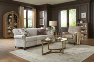
Coordinating Furniture with Wood Floors: Undertones, Contrast, and Finish Strategy
26th Aug 2026
Wood floors are one of the strongest design elements in a room. They cover a large surface, set the warmth of the space, and affect how every furniture finish looks nearby. A dining table, coffee table, media console, bedroom set, accent chair, sofa fabric, or leather recliner may look beautiful on its own, but it still needs to work with the floor.
The goal is not to match every wood tone perfectly. In fact, matching the floor and furniture too closely can make the room feel flat. The goal is to understand the undertone of the floor, choose contrast intentionally, and use finishes that feel connected rather than accidental.
Here is how to coordinate furniture with wood floors using undertones, contrast, rugs, upholstery, and finish strategy.
Start with the floor as the anchor
In most rooms, the wood floor is the dominant wood tone. It is the largest wood surface and usually the least likely piece to change.
Before choosing furniture, study the floor.
Look at:
-
Wood species
-
Stain color
-
Lightness or darkness
-
Warm or cool undertone
-
Grain pattern
-
Finish sheen
-
Variation from board to board
-
Nearby trim, doors, cabinets, or built-ins
The floor does not need to dictate every choice, but it should guide the direction.
A room with golden oak floors needs a different furniture strategy than a room with gray-stained flooring. A dark walnut floor needs a different balance than a pale maple floor. A red-toned cherry floor needs careful finish choices so the room does not feel too warm or too heavy.
Understand wood undertones
Wood is not just light or dark. It also has an undertone.
Warm wood undertones
Warm wood floors may lean:
-
Yellow
-
Gold
-
Orange
-
Red
-
Honey
-
Amber
-
Brown
-
Caramel
Common examples include many oak, cherry, hickory, maple, pine, and warm walnut floors.
Warm floors usually feel cozy, traditional, natural, and inviting.
Cool wood undertones
Cool wood floors may lean:
-
Gray
-
Ash
-
Blue-gray
-
Green-gray
-
Charcoal
-
Taupe-gray
Cool wood floors are often found in gray-stained hardwood, ash tones, weathered finishes, white oak with a cooler finish, and some modern flooring colors.
Cool floors usually feel cleaner, quieter, more modern, or more casual.
Neutral wood undertones
Some floors sit closer to the middle.
Neutral wood floors may include:
-
Natural white oak
-
Soft brown oak
-
Balanced walnut
-
Light brown maple
-
Greige-stained wood
-
Medium brown floors without strong red, yellow, or gray undertones
Neutral floors are often the most flexible because they can work with a wider range of furniture finishes.
Do not rely on the name of the wood alone
Wood species helps, but stain changes everything.
Oak can be golden, whitewashed, gray, dark brown, or almost black. Maple can be pale, amber, or brown. Walnut can feel warm and chocolatey or cooler and more refined depending on the finish.
Always judge the floor by what you see in the room, not only by the species name.
The lighting, stain, age, finish, and surrounding colors all affect how the wood reads.
Identify the floor’s dominant color family
Stand back and ask: what color do I notice first?
Is the floor mostly:
-
Honey
-
Golden brown
-
Orange brown
-
Red brown
-
Chocolate brown
-
Pale natural
-
Gray brown
-
Charcoal
-
Whitewashed
-
Rustic multi-tone
This gives you the starting point.
If the floor reads golden, choose furniture that either respects that warmth or clearly contrasts it with a bridge. If the floor reads gray, avoid furniture finishes that turn too yellow or orange unless the room has enough warmth elsewhere to make the contrast feel intentional.
Contrast usually looks better than a near match
One of the biggest mistakes is choosing furniture that is almost the same color as the floor.
When a wood table, chair, or cabinet is close to the floor color but not exact, the difference can look accidental. The furniture may blend into the floor or make both finishes look slightly off.
A better strategy is usually one of these:
-
Match intentionally
The undertone and depth are very close, and the pieces feel like a planned set. -
Contrast clearly
The furniture is noticeably lighter, darker, warmer, or cooler in a way that looks deliberate.
The middle ground is often the hardest.
For example, a medium brown table on a medium brown floor can disappear. A dark walnut table on a light oak floor looks more intentional. A light maple table on a dark floor creates clean contrast. A painted sideboard on a wood floor gives the eye a break.
Use light and dark contrast
The easiest type of contrast is value contrast. Value means how light or dark something is.
Light floors
Light floors often work well with:
-
Medium wood furniture
-
Dark wood furniture
-
Black accents
-
Warm leather
-
Painted finishes
-
Textured upholstery
-
Darker rugs
-
Walnut, cherry, or brown-stained pieces
A room with light floors can handle darker furniture because the floor keeps the space feeling open.
Dark floors
Dark floors often work well with:
-
Light wood furniture
-
Medium wood furniture
-
Cream upholstery
-
Oatmeal fabrics
-
Lighter rugs
-
Painted finishes
-
Brass or bronze accents
-
Glass or metal pieces in moderation
A room with dark floors can feel heavy if every furniture piece is also dark. Use contrast to lift the room.
Medium floors
Medium floors usually need the most strategy because many wood furniture pieces land in the same range.
With medium floors, try:
-
Darker coffee table
-
Lighter rug
-
Painted media console
-
Leather chair
-
Upholstered bed
-
Dining table with a clearer contrast
-
Black or bronze accents
-
A mix of wood and fabric
Medium floors benefit from clear separation between the floor and furniture.
Keep undertones compatible
Contrast works best when undertones still relate.
A light warm oak floor can look beautiful with a dark warm walnut table. They are different in value, but they both have warmth.
A cool gray-brown floor can work well with charcoal, black, cool walnut, or greige finishes.
Trouble happens when the undertones fight.
Examples of difficult combinations:
-
Yellow oak floor with very cool blue-gray furniture
-
Red cherry floor with orange-brown furniture
-
Gray floor with yellow beige wood furniture
-
Warm hickory floor with cool ash-gray case goods
-
Pink beige floor tones with yellow-orange furniture
These combinations can still work, but they usually need a bridge through rugs, upholstery, wall color, metal, or accent pieces.
Use a rug as the bridge
A rug is one of the best tools for coordinating furniture with wood floors.
A rug can:
-
Physically separate wood furniture from wood flooring
-
Bring warm and cool tones together
-
Add contrast under a table or sofa
-
Keep wood from blending into wood
-
Soften a dark floor
-
Ground a light floor
-
Connect upholstery, leather, and wood finishes
For example:
-
A walnut coffee table on oak floors may look better with a rug between them.
-
A dining table that is close in color to the floor can stand out more on a patterned rug.
-
A gray floor and warm wood table can feel more connected with a rug that includes taupe, cream, brown, and gray.
When in doubt, place a rug between large wood furniture and wood flooring. It gives the room breathing room.
Upholstery is part of the finish strategy
Coordinating furniture with wood floors is not only about wood furniture. Upholstery matters too.
A sofa, sectional, recliner, dining chair fabric, or upholstered bed can help balance the floor.
Warm floors pair well with:
-
Cream
-
Oatmeal
-
Camel
-
Warm gray
-
Taupe
-
Mushroom
-
Olive
-
Brown leather
-
Textured neutral fabric
-
Warm charcoal
Cool floors pair well with:
-
Greige
-
Stone
-
Light gray
-
Charcoal
-
Cool taupe
-
Slate
-
Blue-gray
-
Soft white
-
Pewter
-
Black leather
Dark floors pair well with:
-
Ivory
-
Cream
-
Light taupe
-
Oatmeal
-
Pale gray
-
Textured linen-look fabric
-
Light leather
-
Patterned fabric with contrast
Light floors pair well with:
-
Medium taupe
-
Brown leather
-
Charcoal
-
Olive
-
Warm gray
-
Textured gray
-
Camel
-
Darker accent fabrics
Upholstery can either calm the wood tones or add contrast where the room needs depth.
Leather is a strong bridge with wood floors
Leather works especially well with wood because it brings warmth, depth, and natural character.
Warm leather tones include:
-
Cognac
-
Saddle
-
Caramel
-
Chestnut
-
Tobacco
-
Chocolate brown
These tones work beautifully with many wood floors, especially oak, hickory, walnut, maple, and cherry.
Leather is useful when:
-
A room feels too gray
-
A room feels too pale
-
Wood furniture feels disconnected from the floor
-
You need warmth without adding pattern
-
You want a chair, ottoman, or recliner to ground the space
A fabric sofa with a leather chair is often easier to coordinate with wood floors than a full room of matching wood furniture.
Painted finishes can break up too much wood
If the room already has wood floors, wood trim, wood doors, wood cabinets, and wood furniture, another wood finish may be too much.
Painted furniture can give the room relief.
Good painted finish options:
-
Soft white
-
Cream
-
Black
-
Charcoal
-
Warm gray
-
Greige
-
Sage
-
Navy
-
Deep green
-
Soft taupe
Painted pieces work well for:
-
Media consoles
-
Sideboards
-
Nightstands
-
Bookcases
-
Accent cabinets
-
Dining chairs
-
Bedroom furniture
-
Occasional tables
A painted finish can keep the room from feeling like everything is trying to match the floor.
Black is a useful grounding finish
Black can help connect mixed wood tones. It gives the room structure and makes the wood choices feel more intentional.
Use black in:
-
Lamp bases
-
Picture frames
-
Chair legs
-
Curtain rods
-
Table bases
-
Hardware
-
Accent tables
-
Mirror frames
-
Dining chairs
-
Media consoles
Black works especially well when the room has several wood tones and needs a common thread.
Use it in small doses if you want contrast without making the room feel heavy.
Metal finishes matter too
Metal can either warm up or cool down a room.
Warm metals
Good with warm floors:
-
Brass
-
Aged brass
-
Bronze
-
Oil-rubbed bronze
-
Antique gold
These work well with oak, cherry, walnut, hickory, maple, and warm brown floors.
Cool metals
Good with cool floors:
-
Brushed nickel
-
Chrome
-
Pewter
-
Matte silver
-
Gunmetal
These work well with gray floors, cool white walls, and more modern furniture.
Black metal
Black works with almost everything because it acts as a neutral anchor.
The metal finish does not have to match every piece, but it should be repeated. A single random metal finish can feel accidental.
Finish sheen affects the room
Wood furniture finish is not only about color. Sheen matters.
Common sheens include:
-
Matte
-
Low sheen
-
Satin
-
Semi-gloss
-
Glossy
Most rooms feel more timeless with matte, low-sheen, or satin wood finishes. High-gloss finishes can work in modern or formal spaces, but they draw more attention and can feel more intense.
If the floors are shiny, use lower-sheen furniture to create balance.
If the floors are matte, satin furniture can add subtle polish.
Too many glossy finishes can make the room feel busy. Too many flat finishes can make it feel dull. A mix is usually best.
Dining room strategy
Dining rooms often have the most direct wood-on-wood issue because the dining table and chairs sit directly on the wood floor.
If the dining table is close to the floor color
Use:
-
A rug under the table
-
Upholstered dining chairs
-
Painted chairs
-
Different chair finish
-
Table with a contrasting base
-
Sideboard in a painted or darker finish
-
Lighter or darker chair fabric
If the table contrasts clearly with the floor
You may not need as much separation. Still, a rug can help soften the room and define the dining area.
Strong dining room formulas
Light oak floor
-
Walnut dining table
-
Upholstered chairs
-
Cream or taupe rug
-
Black or brass light fixture
Medium brown floor
-
Painted dining chairs
-
Darker table or lighter table
-
Patterned rug
-
Sideboard in black, cream, or contrasting wood
Dark floor
-
Light or medium wood table
-
Upholstered chairs
-
Light rug
-
Warm metal lighting
Gray floor
-
Greige or walnut table
-
Black accents
-
Cream upholstery
-
Rug with gray, taupe, and brown tones
Living room strategy
Living rooms have more flexibility because rugs, upholstery, pillows, leather, and tables can all help balance the floor.
If the floor is warm
Try:
-
Textured neutral sofa
-
Warm leather chair
-
Walnut or darker coffee table
-
Cream, taupe, or olive pillows
-
Rug with warm neutrals
-
Brass or bronze lamps
If the floor is cool
Try:
-
Greige or stone sofa
-
Charcoal or black accents
-
Cool walnut or painted media console
-
Rug with gray and taupe
-
Warm leather only if repeated elsewhere
-
Pewter, black, or mixed metal lighting
If the floor is dark
Try:
-
Light sofa
-
Medium wood tables
-
Lighter rug
-
Glass or metal accents
-
Cream drapery
-
Warm lamps
If the floor is light
Try:
-
Medium or dark coffee table
-
Leather accent chair
-
Charcoal or taupe upholstery
-
Black accents
-
Patterned rug
-
Richer wood media console
The rug is often the key piece in a living room because it separates furniture from flooring and ties colors together.
Bedroom strategy
Bedrooms need calm, so wood coordination should feel softer and less busy.
Common bedroom wood issues:
-
Wood bed too close to the floor color
-
Matching bedroom set feels heavy
-
Dark bed on dark floor feels too strong
-
Nightstands and dresser all match the floor too closely
-
Too many wood surfaces with no upholstery
Good solutions:
-
Use an upholstered bed to soften the room
-
Choose nightstands in a painted finish
-
Add a rug under the bed
-
Use bedding to break up wood tones
-
Choose a dresser that contrasts clearly with the floor
-
Mix wood and fabric instead of using a full matching set
Strong bedroom formulas
Warm wood floor
-
Upholstered headboard
-
Walnut or painted nightstands
-
Cream bedding
-
Wool rug
-
Bronze lamps
Dark wood floor
-
Light rug
-
Upholstered or lighter wood bed
-
Cream bedding
-
Medium wood dresser
-
Soft drapery
Gray wood floor
-
Greige upholstered bed
-
Black or cool walnut nightstands
-
Soft white bedding
-
Taupe rug
-
Pewter or black lamps
A bedroom should feel restful, not like every wood finish is competing.
Open concept strategy
Open concept rooms need extra attention because wood floors often run through the living, dining, and kitchen areas.
Look at:
-
Flooring
-
Kitchen cabinets
-
Island finish
-
Dining table
-
Dining chairs
-
Living room tables
-
Media console
-
Bar stools
-
Built-ins
-
Window treatments
-
Rugs
The goal is to repeat wood tones and finishes enough that the space feels connected.
Good open concept strategy:
-
Let the floor be the dominant wood tone.
-
Choose one secondary wood tone for major furniture.
-
Use one or two painted, upholstered, leather, or metal pieces for contrast.
-
Repeat each major finish at least twice.
-
Use rugs to define living and dining zones.
For example:
-
Oak floors
-
Walnut dining table
-
Walnut coffee table
-
Cream upholstered chairs
-
Black light fixtures
-
Natural woven shades
-
Rugs with cream, taupe, and brown tones
This feels connected without making every finish identical.
How many wood tones can one room handle?
Most rooms work best with two to three wood tones.
A simple approach:
-
Dominant tone: the floor
-
Secondary tone: large furniture pieces
-
Accent tone: smaller tables, frames, chairs, or decor
If you use more than three wood tones, the room may still work, but it needs strong repetition and a controlled palette.
Wood tones are easier to mix when:
-
Undertones are compatible
-
Contrast is clear
-
A rug separates large wood pieces from the floor
-
Upholstery breaks up the wood surfaces
-
Metal finishes repeat
-
The wall color supports the palette
The more wood tones you use, the more important repetition becomes.
Matching all wood tones can look flat
A full matching set can feel coordinated, but it can also make the room look less layered.
This is especially true when:
-
The floor matches the table
-
The table matches the chairs
-
The chairs match the sideboard
-
The sideboard matches the trim
-
The room has little upholstery or contrast
Everything may technically match, but nothing stands out.
A more finished room often has a mix:
-
Wood floor
-
Contrasting table
-
Upholstered chairs
-
Painted sideboard
-
Metal light fixture
-
Rug that ties everything together
The room feels more collected and less like a showroom set.
What to do with red or orange wood floors
Red and orange undertones can be challenging because they are strong.
Common floors:
-
Cherry
-
Red oak with warm stain
-
Orange-toned pine
-
Amber maple
-
Some older varnished floors
Good strategies:
-
Use cream, taupe, olive, mushroom, or warm gray upholstery
-
Avoid yellow-orange furniture finishes
-
Use rugs with warm neutrals and muted colors
-
Choose darker brown furniture for contrast
-
Use black accents to ground the warmth
-
Add leather in cognac or deeper brown if it relates
-
Consider painted case goods
Be careful with cool gray furniture directly against orange floors. The contrast can make both tones feel stronger.
A rug is often the easiest way to soften red or orange floor undertones.
What to do with gray wood floors
Gray wood floors can feel clean, but they can also feel cold if everything else is gray.
Good strategies:
-
Use greige, taupe, cream, or warm gray upholstery
-
Add warm wood in controlled amounts
-
Use black accents for structure
-
Bring in leather if the room needs warmth
-
Choose rugs with gray, taupe, cream, and brown
-
Avoid strong yellow-beige woods
-
Use soft white or muted color to warm the palette
If every piece is gray, the room may feel flat. Add warmth through texture, leather, wood, or woven materials.
What to do with very dark wood floors
Dark floors are beautiful, but they need contrast.
Good strategies:
-
Use lighter rugs
-
Choose cream or oatmeal upholstery
-
Add medium wood furniture
-
Use brass, bronze, or black accents carefully
-
Avoid all dark furniture
-
Add layered lighting
-
Use lighter window treatments
-
Choose chairs with exposed legs or fabric contrast
Dark floors can make a room feel rich and grounded, but too many dark pieces can make it feel heavy.
Let the floor be the deepest element, then build lighter layers above it.
What to do with very light wood floors
Light wood floors feel airy and natural, but the room may need grounding.
Good strategies:
-
Use medium or dark wood furniture
-
Add black or bronze metal
-
Bring in leather
-
Use textured rugs
-
Choose medium-tone upholstery
-
Add contrast through pillows and lamps
-
Avoid making every piece pale
A room with light floors, white walls, cream sofa, pale rug, and light wood tables may feel washed out unless there is enough texture and contrast.
Light floors give you room to add depth.
Use wall color as the supporting layer
Wall color affects how wood floors and furniture finishes read.
Warm walls
Cream, warm white, beige, and taupe walls usually support warm floors and warm wood furniture well.
Cool walls
Cool white, blue-gray, green-gray, and gray walls often support cooler floors or mixed wood tones.
Greige walls
Greige is a strong bridge between warm and cool wood finishes.
Dark walls
Dark walls can make wood finishes feel richer, but they need enough contrast through rugs, upholstery, and lighting.
If the wood floor and furniture feel disconnected, the wall color may be part of the problem. A warmer or more balanced wall color can sometimes make mixed wood tones feel more intentional.
Use window treatments to soften wood floors
Window treatments are another bridge.
Good options:
-
Linen-look drapery
-
Woven wood shades
-
Roman shades
-
Soft neutral panels
-
Warm white drapery
-
Taupe or greige shades
-
Textured natural shades
If the room has a lot of wood, fabric window treatments can soften it. If the room feels too cool, woven shades can add warmth. If the room feels too heavy, lighter drapery can lift it.
Window treatments help balance the floor vertically.
Finish strategy by room style
Traditional
Use:
-
Warm wood floors
-
Richer brown furniture
-
Upholstered seating
-
Classic rugs
-
Brass or bronze
-
Leather accents
-
Painted pieces for relief
Avoid making every wood piece the same red or dark brown tone.
Transitional
Use:
-
Balanced wood tones
-
Cream, taupe, greige, or warm gray upholstery
-
Clear contrast between floor and furniture
-
Simple rugs
-
Mixed wood and painted finishes
-
Black, brass, or bronze accents
This style is especially good for mixing wood tones cleanly.
Modern
Use:
-
Light or cool wood floors
-
Clean-lined furniture
-
Black accents
-
Low-sheen finishes
-
Smooth upholstery
-
Strong contrast
-
Minimal but warm wood repetition
Avoid too many orange or glossy wood finishes.
Farmhouse or relaxed
Use:
-
Natural wood floors
-
Painted furniture
-
Woven texture
-
Leather accents
-
Linen-look upholstery
-
Warm rugs
-
Black or bronze hardware
Keep it layered, but not overly rustic.
Mid-century
Use:
-
Walnut tones
-
Tapered legs
-
Light or medium floors
-
Warm leather
-
Simple fabrics
-
Clean contrast
-
Matte or satin finishes
Mid-century pieces often work well with both light and medium floors when there is enough contrast.
Common mistakes to avoid
Mistake 1: Trying to match the floor exactly
A near match often looks accidental. Clear contrast usually looks better.
Mistake 2: Ignoring undertones
Light and dark matter, but undertone matters too. Warm and cool woods can fight if there is no bridge.
Mistake 3: Using too much of one wood
Wood floors, wood tables, wood chairs, wood trim, and wood cabinets can feel heavy without upholstery, rugs, or painted finishes.
Mistake 4: Skipping the rug
A rug can solve many wood-on-wood problems.
Mistake 5: Choosing gray furniture automatically
Gray does not work with every wood floor. Cool gray can look harsh against warm oak or cherry.
Mistake 6: Forgetting finish sheen
Glossy furniture on glossy floors can feel busy. Low-sheen finishes often look more timeless.
Mistake 7: Not repeating the contrast tone
If you use black, walnut, cognac leather, or painted cream once, repeat it somewhere else.
Quick furniture guide by floor type
Golden oak floors
Try:
-
Walnut
-
Warm taupe upholstery
-
Cream fabrics
-
Brown leather
-
Olive accents
-
Black hardware
-
Patterned rug with warm neutrals
Red oak or cherry floors
Try:
-
Cream upholstery
-
Mushroom
-
Warm gray
-
Dark brown wood
-
Black accents
-
Muted green
-
Rug with taupe and cream
Hickory floors
Try:
-
Simple furniture finishes
-
Solid upholstery
-
Leather accents
-
Warm brown or black details
-
Quiet rugs
-
Painted case goods
Hickory often has strong grain and variation, so keep other finishes calmer.
Light maple floors
Try:
-
Medium wood furniture
-
Walnut accents
-
Textured fabric
-
Warm gray
-
Camel leather
-
Black or bronze metal
Walnut floors
Try:
-
Cream upholstery
-
Lighter rugs
-
Light or medium wood accents
-
Brass or bronze
-
Warm gray
-
Soft white walls
Gray wood floors
Try:
-
Greige upholstery
-
Charcoal accents
-
Black metal
-
Cool walnut
-
Cream rugs
-
Warm leather in small doses
Very dark floors
Try:
-
Light rugs
-
Cream or oatmeal sofa
-
Medium wood furniture
-
Painted pieces
-
Upholstered chairs
-
Layered lighting
Very light floors
Try:
-
Medium or dark furniture
-
Leather accents
-
Textured rugs
-
Taupe upholstery
-
Black or bronze details
-
Warm wood tables
Simple formulas that work
Light floor, rich furniture
-
Light oak floor
-
Walnut dining table
-
Upholstered chairs
-
Cream rug
-
Black or brass lighting
Warm floor, neutral upholstery
-
Golden oak floor
-
Oatmeal sofa
-
Dark wood coffee table
-
Brown leather chair
-
Taupe rug
Dark floor, light layers
-
Dark walnut floor
-
Cream sofa
-
Light rug
-
Medium wood tables
-
Bronze lamps
Gray floor, warm bridge
-
Gray wood floor
-
Greige sectional
-
Cognac leather chair
-
Rug with gray, taupe, and cream
-
Black metal accents
Red-toned floor, softened palette
-
Cherry or red oak floor
-
Mushroom upholstery
-
Dark brown sideboard
-
Cream rug
-
Muted green accents
Checklist before choosing furniture finishes
Ask:
-
Is the floor warm, cool, or neutral?
-
Is the floor light, medium, or dark?
-
Does the furniture contrast clearly with the floor?
-
Are the undertones compatible?
-
Would a rug help separate wood from wood?
-
Is there too much wood in the room?
-
Would upholstery, leather, metal, or a painted finish help?
-
Is the finish sheen too glossy or too flat?
-
Is each major finish repeated somewhere else?
-
Does the room feel connected without looking overly matched?
Good finish strategy makes the room feel collected, not accidental.
Final thoughts
Coordinating furniture with wood floors is about balance. The floor is the anchor, but the furniture does not need to match it exactly. In many rooms, clear contrast looks more polished than a near match.
Start by identifying the floor’s undertone. Then decide whether the furniture should blend, contrast, or bridge the room’s warm and cool elements. Use rugs, upholstery, leather, painted finishes, metal, and window treatments to connect everything.
The best rooms do not look like every wood tone came from the same set. They look intentional, layered, and comfortable. When the undertones, contrast, and finishes work together, the wood floor becomes a foundation for the room instead of a design problem to work around.